Quinn Neumann · 26 September 2026
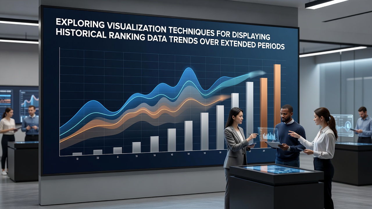
Exploring Visualization Techniques for Displaying Historical Ranking Data Trends Over Extended Periods
Researchers and analysts have long examined methods for presenting historical ranking data across years or even decades because such information often reveals patterns that static snapshots cannot capture, and effective visualizations turn raw lists into clear narratives about shifts in position, performance, or status. Data from sources like government statistical agencies shows that ranking datasets frequently include repeated measurements of entities such as organizations, regions, or indicators, which creates opportunities for techniques that highlight movement rather than isolated values.
Core Challenges in Representing Extended Ranking Sequences
Historical ranking datasets present unique difficulties because positions change over time while the underlying scales and comparison groups may also evolve, so visualizations must account for these variables without introducing distortion. Observers note that simple tables fail to convey momentum or acceleration in rank changes, whereas well-designed graphics allow viewers to trace trajectories across extended intervals. Data from Eurostat indicates that many public ranking series now span multiple decades, which increases the need for methods that compress large temporal ranges while preserving detail at key transition points.
One common obstacle arises when the number of ranked items grows or shrinks between periods, requiring adjustments that maintain comparability across the entire timeline. Analysts address this by normalizing ranks or focusing on percentile positions, and the resulting displays help reveal whether an entity maintained consistent standing or experienced gradual decline or improvement. Those who work with such data often combine multiple visual layers to show both individual paths and aggregate trends within the same view.
Established Visualization Approaches and Their Applications
Line charts remain a foundational technique because they connect sequential rank positions for each entity, allowing direct observation of rises, falls, and periods of stability across the full time span. When multiple lines appear together, patterns of convergence or divergence become visible, and color coding by category or region adds another dimension without overwhelming the display. Slope graphs offer a compact alternative for comparing ranks at two distant points, yet they lose intermediate detail that extended timelines require, so practitioners frequently pair them with fuller time-series views.
Heatmaps provide a different perspective by using color intensity to represent rank values across both entities and time periods simultaneously, which proves useful when the dataset contains dozens of items tracked over many years. This approach condenses large matrices into readable blocks where darker or lighter shades immediately signal high or low positions, and annotations can mark significant events that influenced rank movements. Animated sequences add a temporal playback element, letting viewers watch ranks evolve frame by frame, although static versions with small multiples often serve similar purposes while remaining printable and shareable.
Advanced and Emerging Methods for Complex Datasets
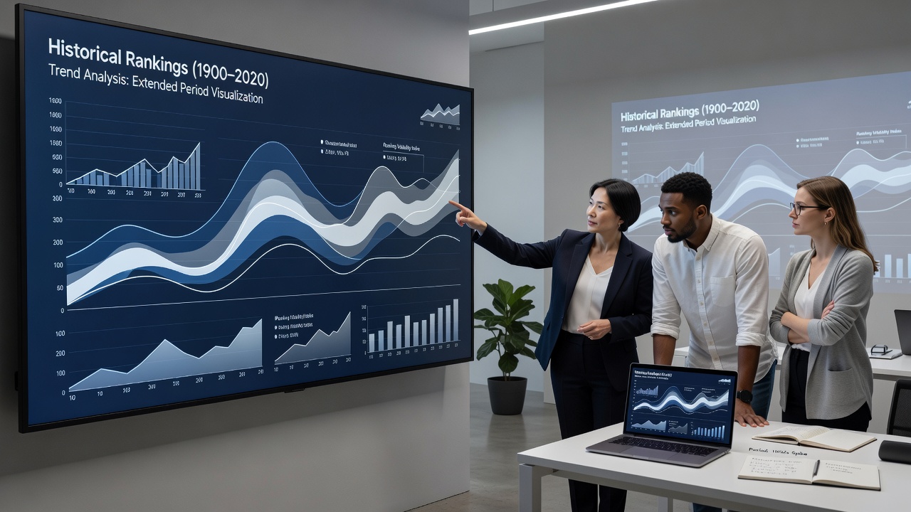
Stream graphs and stacked area charts adapted for ranks display cumulative shifts in position distribution, revealing how the composition of top, middle, and lower tiers changes over long periods. These techniques work particularly well when the focus lies on overall system dynamics rather than single-entity stories. Bump charts, which plot lines that cross according to rank order, emphasize overtaking events and have gained traction in reports covering competitive fields where position swaps carry interpretive weight.
Interactive dashboards now integrate brushing and filtering controls that let users zoom into specific decades or isolate subsets of entities, and such tools draw from principles outlined in research from institutions like those publishing through Statistics Canada. As of September 2026, several national statistical offices have released updated APIs that supply standardized historical ranking series, which in turn supports more consistent cross-border comparisons. Tree maps with temporal sliders represent another option for hierarchical rankings, where nested rectangles resize according to position changes while maintaining structural relationships.
Researchers continue to test hybrid displays that merge geographic maps with rank overlays when location influences the data, and these layered views help identify regional clusters of improvement or decline across extended timeframes. The choice among techniques typically depends on the audience and the specific questions the visualization must answer, whether those concern individual trajectories or broader structural evolution.
Conclusion
Effective visualization of historical ranking data over extended periods requires careful selection among established and emerging techniques that balance clarity, accuracy, and information density. Line charts, heatmaps, slope graphs, and interactive formats each address different aspects of temporal rank sequences, and their combined use often yields the most comprehensive understanding. Continued refinement of these methods, supported by expanding public datasets, enables clearer communication of long-term trends across diverse fields.